Solor Panels, coffee and Candy
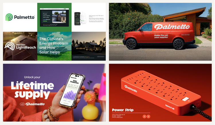
One of these things is not like the other…
Looking at the image above there is one that stands out just a bit from the others. 😅
I think its pretty clear how much of an upgrade the new branding is. The colors feel fresh and interesting, the photography moved from stock images to commissioned work that reflects their unique style and tone of voice.
What a refinement!
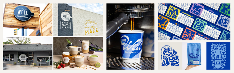
This coffee company went from great to exceptional, The one on the left I would want to check out, but the upgrade makes it something that wont be soon forgotten.
The best branding really does stand on its own, If you are ever concerned that your branding isn’t the best representation of your business be sure to reach out cause I would love to help!
Link: Coffee Brand Website
Did you know starburst rebranded?
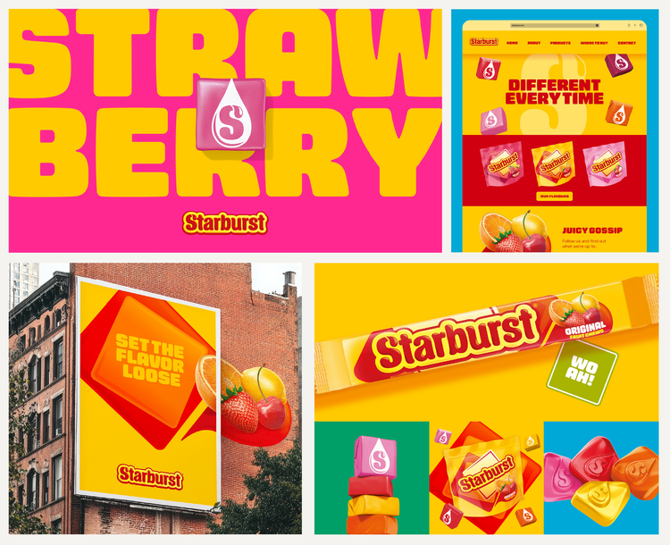
Its always curious when a big company like Starburst rebrands.
Design work is all about getting results and solving problems so there must have been something they saw in their current design that wasn’t serving the brand well.
From their presentation about the new identity they had this to say: Evolving the brand foundations we established a new sense of individuality, and harnessed a Starburst definition of joy. With refreshed brand assets, a reimagined word mark, playful typography and a distinct colour palette, the Starburst iconic square shape and fruitiness now lives in a universe of joy that invites everyone in, stands out and differentiates the brand’s many SKUs
I think only time will tell if this rebrand works or not but it sure does help the brand POP.
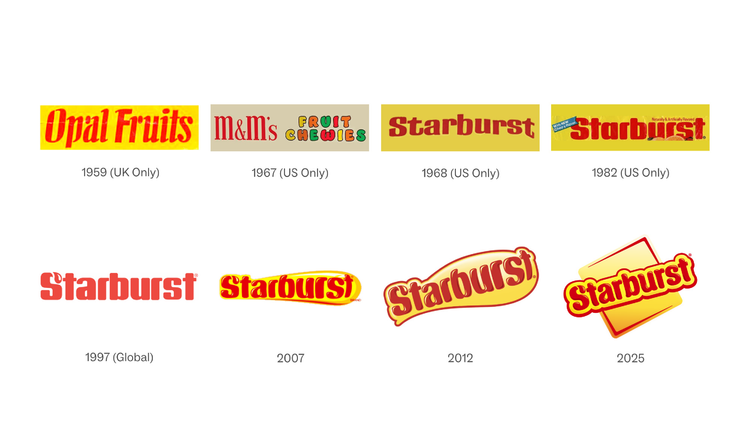
Which Logo do you like this best?
I am partial to the 1997 version and ever remember eating the candy at the time when it had that logo!